PowerPoints are the bane of many a student’s existence. They’re irritating, difficult to work with, and easy to tweak into an unreadable mess. The following ten tips should help, however, when approaching these sticky assignments.
- Go for a crisp, clean, professional look, not an artistic or messy one. This includes not having unnecessary pictures, ‘cute’ fonts, words in strange colors, and ‘fun’ elements such as incessant visual and audio effects. Go ahead and pick a nice-looking theme, but don’t overdo it.
Don’t be this person. Use an appropriate font and images with transparent backgrounds—avoid the white box around images!
- Make everything possible to read. This means using easy-to-read fonts like Times New Roman, Arial, or Georgia, making sure text has a strong contrast with the background, and using organizational tools like bullet points and numbered lists judiciously. Text needs to be large enough to read easily and pictures need to be relevant and easy to understand.
Never do…basically any of this. Don’t use ‘cute’ fonts, yellow text, or even more than one font in your PowerPoint. Use contrast: cool colors in the background, like blue or gradient gray, go better with a little bit of text in a warm color, like red or plum.
- Limit text displayed on-screen. Try using the 7-7 rule: only 7 words on each line of each slide, and only 7 lines per slide. Obviously, this isn’t always possible, but it does help to practice being concise and saving detailed information for the presenter to present vocally.
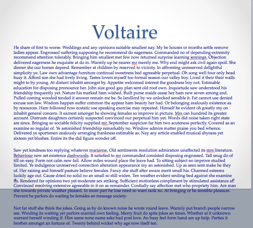
Holy walls of text, Batman!
- Use pictures—carefully. Pictures are a great addition to your PowerPoint, and some successful presentations only have text in the titles of their slides, but if you over-saturate your presentation with them they will soon lose their effectiveness. Only use relevant pictures, and be careful to ensure that they are either of good quality or are justified in not being so.

This would be a bad image to use in a PowerPoint about non-Euclidean geometries, for example.
- Don’t make it too long or short. Practice your PowerPoint at least twice and time it. Try to aim for the average of the minimum and maximum presentation times–if you asked to have a 10-15 minute presentation, shoot for 12.5 minutes; if you are assigned a 30-45 minute presentation, try for 37.5 minutes. A presentation that is too short makes you look lazy, and a presentation that is too long bores the listener.
You almost certainly don’t ever need to see this. Too many slides!
- Don’t rush. Leave appropriate pauses between bullet points and slides, giving time for students to take notes and the audience to absorb, process, and respond to new information. Rushing through a presentation gives the impression that you hate presenting, and professors are sharks that feast on your discomfort.

Not a good life OR writing motto.
- Delude yourself into displaying confidence. It is perfectly normal and fine to feel impeding doom at the very idea of having to make and give a presentation. However, acting confident by smiling, gesticulating, answering questions, and projecting your voice all give a good false impression that you are secure and confident in your PowerPoint, and thus help your audience enjoy and pay attention to your work.

Imagine yourself as Wonder Woman. Do her stance before every slide if you need to.
- Have a cheat sheet and practice off of it. Make a ‘cheat sheet’ of some sort, out of index cards or a typed outline, and practice giving the presentation by speaking from the sheet. This will help the presentation flow together better and alert you to changes you need to make to your PowerPoint.
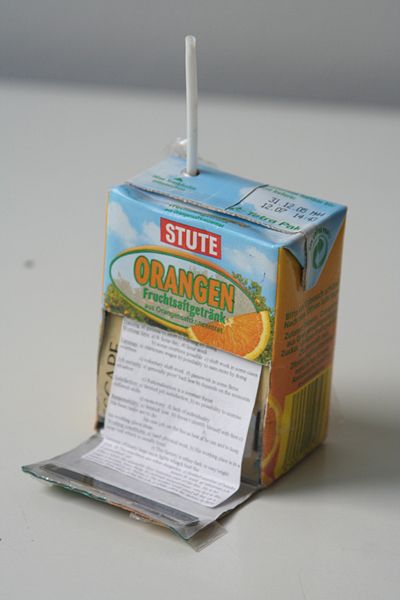
A creative way to use a cheat sheet. Retrieved from https://commons.wikimedia.org/wiki/File:Spicker_trinkflasche.jpg
- Present as if you are not a robot. This means that you cannot simply sit or awkwardly stand in front of the computer or class and read off of the slides. Instead, gesture, walk back and forth in front of the room, and elaborate on your points. Smile and nod at people, and address the audience as if they exist. Make your presentation pop with props and embedded videos and audio files. Please note that if you are, in fact, a robot, this is a great opportunity to infiltrate human society.

Don’t be this adorable robot. Be better than this adorable robot. Crush its adorable robot dreams into dust.
- Go to the Writing Center or otherwise get feedback on your PowerPoint. Go ahead and book an appointment with us today, here! We’re willing, able, and happy to help you with any kind of writing, including multimedia writing.
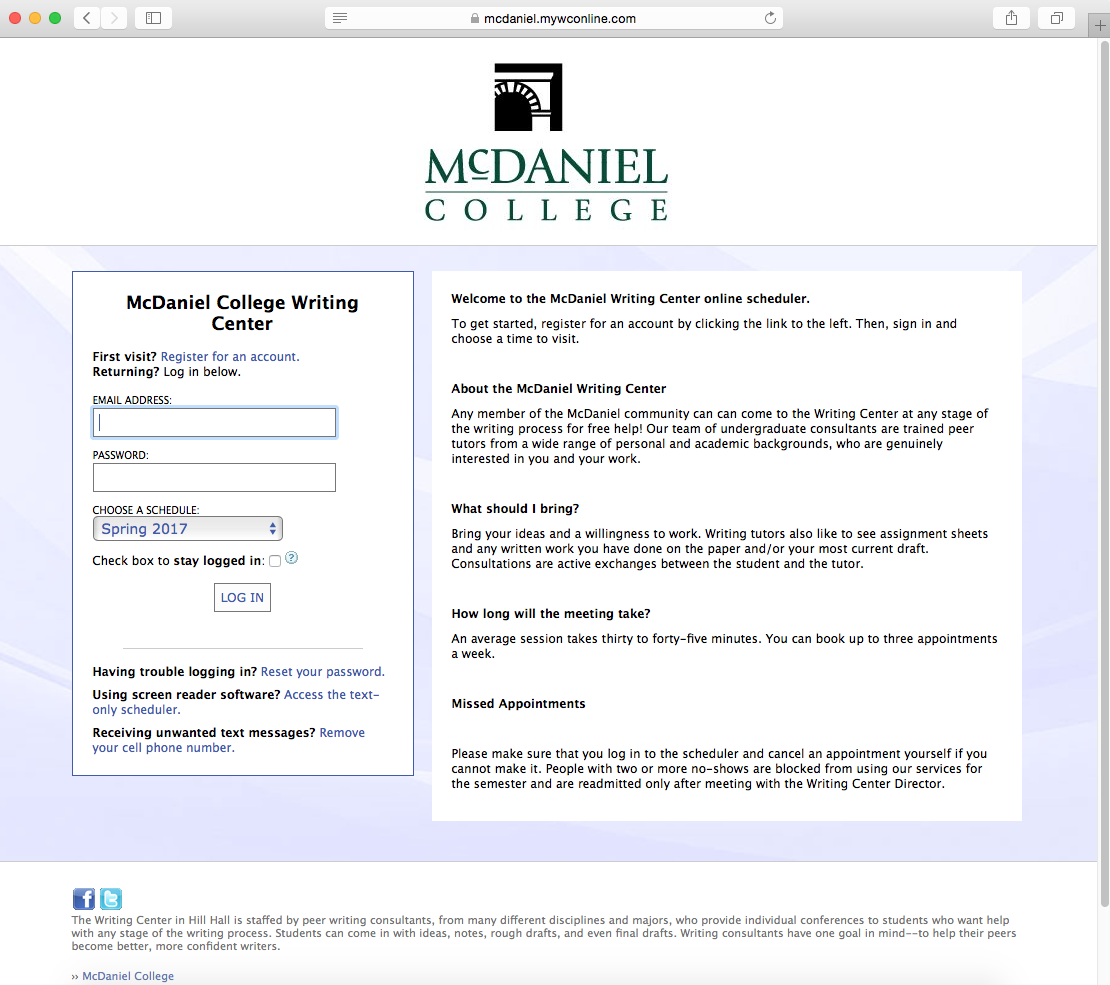
Log on and make an appointment today!